When to use Uber
2015-10-25When should you use Uber rather than a regular taxi? Unless you’re some kind of Randian monster, the answer is obviously more complicated than “whenever Uber is cheaper”. But when is Uber cheaper than a cab?
OpenStreetCab
If you live in New York City, the OpenStreetCab project has some answers. Their analysis began with a dataset made public thanks to Chris Whong’s Freedom of Information Law request. The records in this dataset give the fare and start and end points all yellow cab journeys taken New York City in 2013.
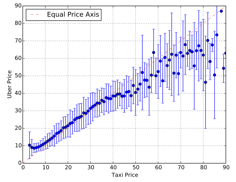
The OpenStreetCab team then queried the Uber API to get the estimated price of the same journeys if they had have been taken by UberX (Uber’s cheapest service). The Uber API returns a price range, so they adopted the mean of the upper and lower bound of these ranges as point estimates. Full details are available in the OpenStreetCab paper. Here’s what they found (Fig. 3 from their paper).
A better plot
It looks like Uber and yellow cabs cost about the same for rides below about $35, but above that UberX is cheaper. But you could argue that the plot above is a little misleading. Here’s a replot of the same data, which tells a different story.
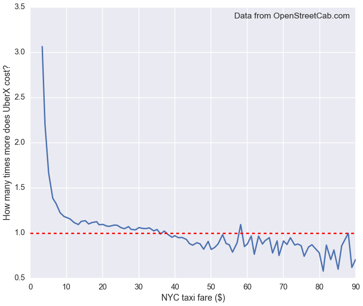
It’s now clear that Uber is more expensive below below $35 (the ratio of the fares is greater than 1), and a lot more expensive for fares below $10.
The move away from the line of equal price for lower fares was all but invisible on the original plot. This is because the data covers a large dynamic range. This is a common visualization problem in many-orders-of-magnitude sciences like astronomy. Often the solution is to switch to logarithmic scales. But there’s a simpler approach that worked well here: plot the ratio of the two values on one of the axes.
An even better plot?
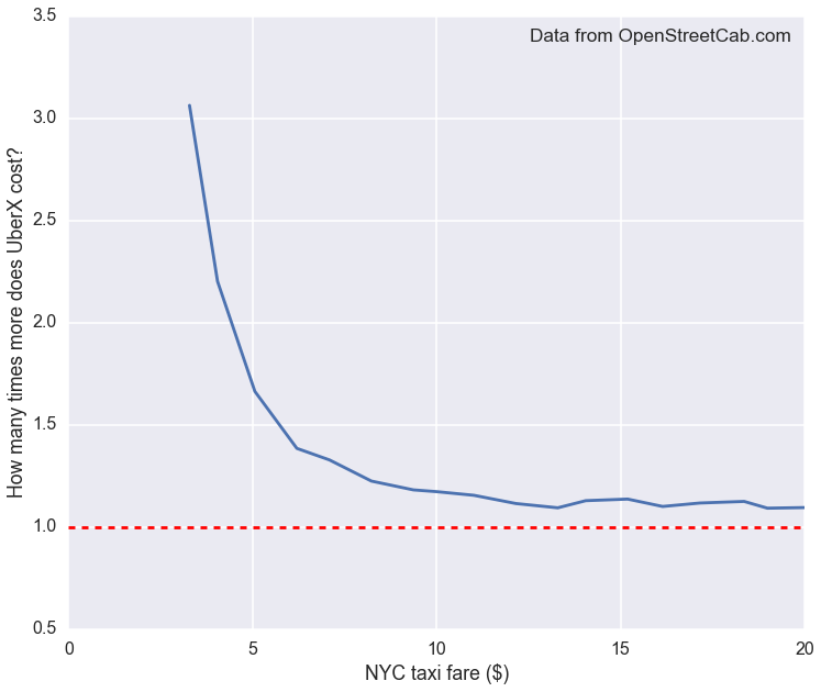
In fact, you could still argue that the ratio plot above is misleading. Fig. 2 of the OpenStreetCab paper shows that the median fare in the data is around $11, and fares over $30 make up a small minority of journeys (around 15%, by eye). Both the original plot and my ratio plot above therefore give undue emphasis to extremely rare expensive fares, giving the false impression that Uber is cheaper half the time.
A smart way to fix this would be to use the width or color of the line to indicate what fraction of rides occur at that price. This would give visual weight to the region of the plot that matters for most of the people, most of the time.
And a more rigorous analysis should take into account the uncertainties on the OpenStreetCab data, which are due to the adopted Uber prices being based on the intervals returned by their API.
But for now, here’s a quick and dirty solution: change the range of the horizontal axis so that you see only the most typical fares.
To sum up: if all you care about is money then don’t use UberX. And, when comparing two similar values over a large range, plot their ratio on one of the axes.
Technical notes
I traced the Fig. 3 in the OpenStreetCab paper using PlotDigitizer.app and put the data in a file. I made the plots with pandas and seaborn.